Revamp registration tool
Project Background
This project focused on replacing a 15-year-old MVP for capacity registrations and approvals. The outdated system was causing delays and usability challenges. As the leading Product Designer, I was responsible for enhancing both the UI and UX to improve efficiency and streamline the registration process for our users.
Reduced lead time by one day, Improved usability by 15%
Interviews
I conducted interviews with 5 users to uncover their pain points and challenges with the existing system. The participants were selected based on their location and diverse roles within the organization.
Roles – Regional Merchandisers, Global Senior Merchandiser, Capacity Product Manager
Location – China, Turkey, Bangladesh
Findings
Users faced significant delays and usability challenges due to an outdated system that hindered registration and approval processes.
FINDING 1
Users struggled with the cluttered interface, which made navigation difficult.
Many expressed a desire for a cleaner, more straightforward design.
FINDING 2
There was a consistent request for real-time progress updates during the approval process.
Users felt uninformed about the status of their submissions.
Finding 3
Manual data entry was seen as time-consuming and prone to mistakes.
Users expressed a strong need for automation or pre-filled fields to streamline the process.
finding 4
Giving a reject reason felt unintuitive and time-consuming.
Users provided feedback via email, resulting in back and forth emailing explaining the reason for the rejection.
Wireframes
My wireframing process allowed me to visualize the new layout and interactions. By focusing on user flow, I ensured that the wireframes emphasized a clean interface, clear navigation and prioritized key features like real-time updates and quick access to information.
"How might we create a cleaner layout that supports users in completing their tasks easily?"
No clear distinction between registration information, actions and the actual form fields.
Tab navigation within the registration forms was unclear, it was not clear how to switch between different sections of the form.
The improved version provided a clear visual hierarchy – Registration details and actions were consistently placed across all forms and the new tab layout above the form made navigation much easier.
We continued wireframing across all pages and moved forward with high-fidelity prototyping with the most promising design solution.
Feedback
I created a fully-functional, high-fidelity prototype of the new flow using Figma. I conducted a workshop with my team (PO and Developers) and invited Stakeholders to gather feedback on the flow and improve features before the release.
Let’s reuse components where possible to save time.
Do we have validation for all input types here?
Where and how do we want to show the reject reason?
What are the most common reject reasons we need to cover?
We’ll need to clarify how the API handles new steps.
Can we fetch last years capacity registration?
We need to clearly distinguish the design for a form: draft, edit, submitted.
What is the default filter on the overview page?
This feels much clearer than the old version.
What kind of statuses will we show?
We should notify the user about status updates on their registration. Do we need an email template?
What will we do in the first release and what will we handle later?
What are the most common reject reasons we need to cover?
What is the default filter on the overview page?
What will we do in the first release and what will we handle later?
before

after
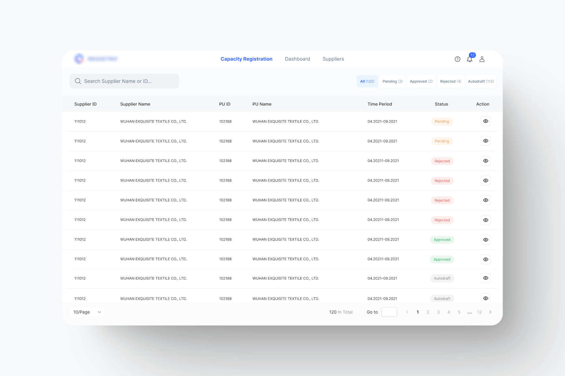
Solution: Lack of overview
Clear overview of all registration forms, including their current status and time period. Search field and filter for better accessibility.
Solution: Lack of overview
Clear overview of all registration forms, including their current status and time period. Search field and filter for better accessibility.
Solution: Manual data entry
Auto-drafting data from the last season with editable fields. Quick update on only the necessary fields for a more efficient input process.
Solution: Manual data entry
Auto-drafting data from the last season with editable fields. Quick update on only the necessary fields for a more efficient input process.
Solution: Reject Reason
The "Reject" button opened a window where users could select one or more reclaim reasons, provide comments, and submit feedback directly within the system.
Solution: Reject Reason
The "Reject" button opened a window where users could select one or more reclaim reasons, provide comments, and submit feedback directly within the system.
Business Impact
SUSBefore releasing the new system, we conducted a System Usability Scale (SUS) survey to establish a baseline, which resulted in a score of 60 (indicating a need for improvement). After implementing the new system, the SUS score increased to 69, reflecting a significant enhancement in usability and user satisfaction.
Lead TimeWe measured the lead time from the moment a submission was opened until registration was approved. With the introduction of new features, we successfully reduced the lead time by one day.
15%
Increase in User Efficiency
1 Day
Reduction in Approval Times
Future release
To further support our users in decision-making and gaining better insights, we designed a dashboard for improved overview and analytics. However, due to the complexity of the implementation, a quick release was not feasible and we postponed it for a follow-up implementation, which began half a year later.
Learnings
Feedback Session – The importance of user feedback in guiding design decisions.
Multiple Ideations – Understanding how small changes can significantly impact user experience.
Interviews, Meetings, Workshop –The need for regular collaboration with stakeholders to align goals.